| Design | Printing | Client |
|---|---|---|
| localkristine | Murat Saman | lululemon |
The Challenge
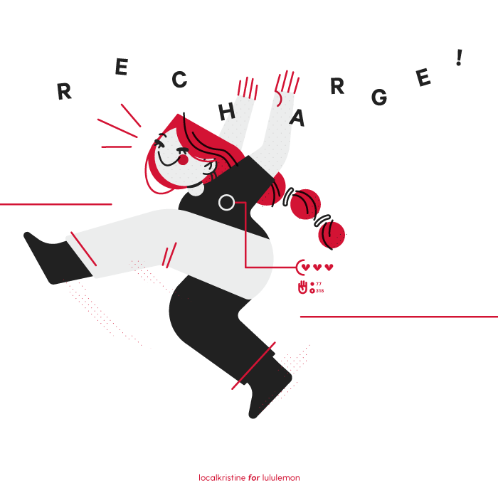
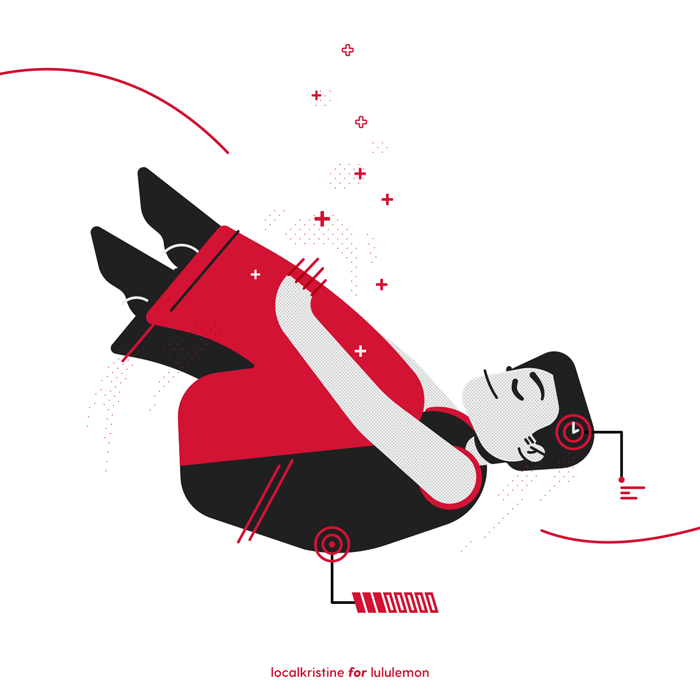
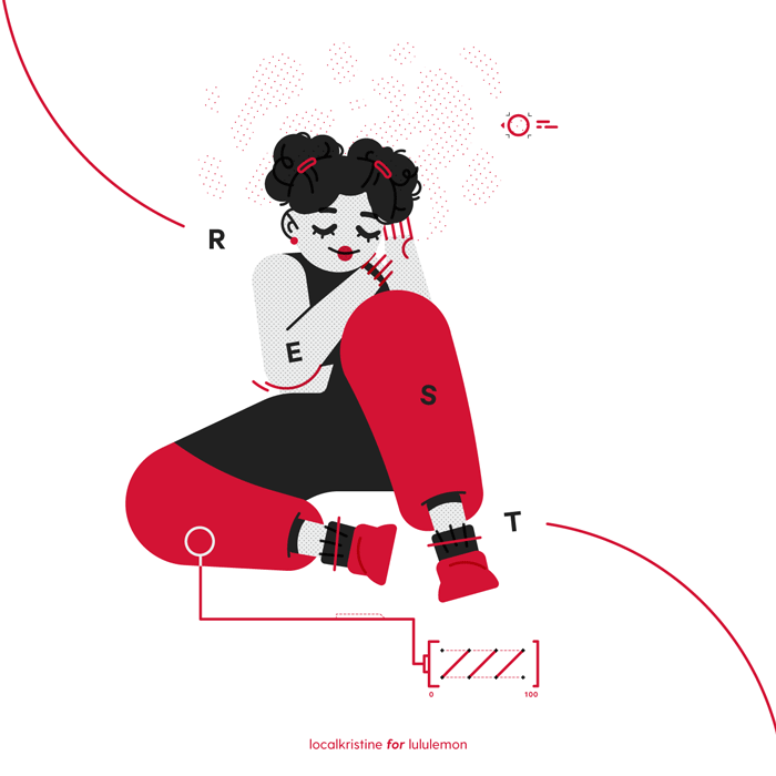
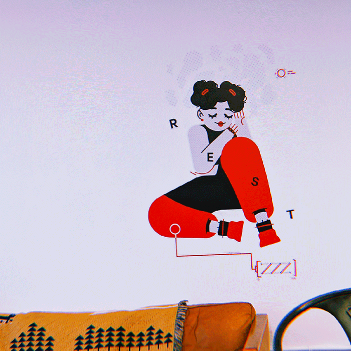
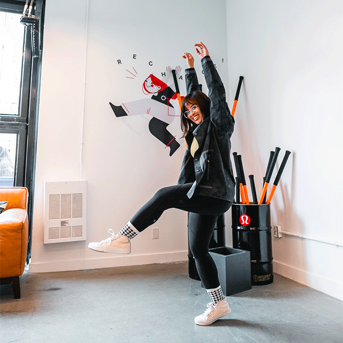
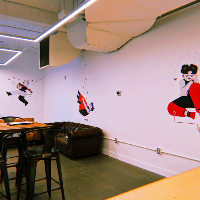
- To create characters representing the cycle of "Rest, Recover, and Recharge" for the walls of Lululemon (at 318 Queen St.)
- To stick within a limited colour palette while incorporating their existing visual identity.
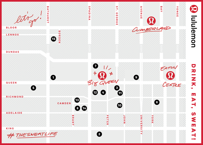
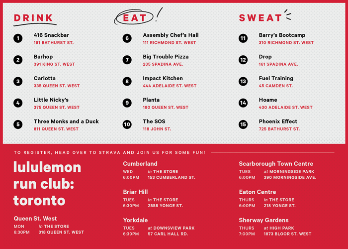
- To design a map accompanying Lululemon's annual 10K run within my established style.
The Solution
Wall Illustrations
Map
The Space
The Process
Concepts
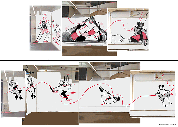
Before settling on the final, we explored the idea of aligning each word to an element.
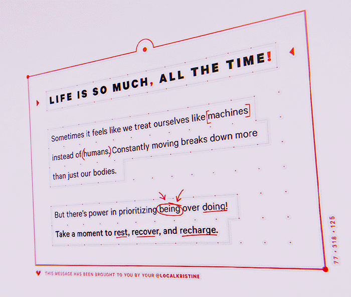
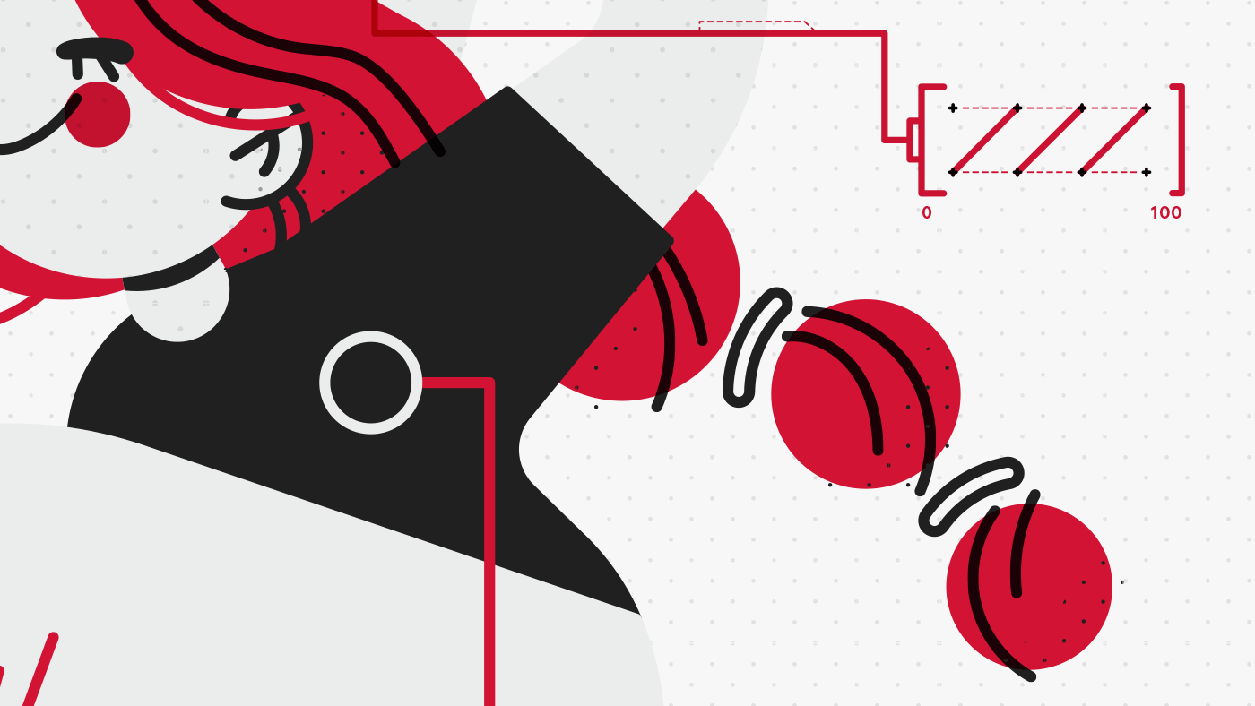
The final concept focused on fusing illustrations with user interface elements to point out how we often "treat ourselves like machines" and the power in "being over doing."
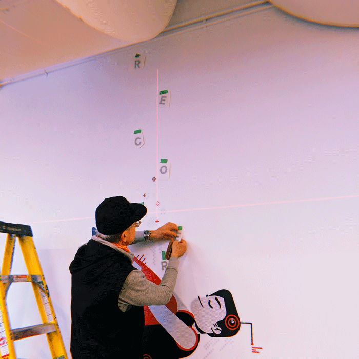
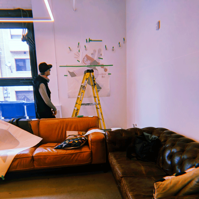
Set-Up
